Designing focus without urgency
A focus system for iOS and macOS that replaces urgency with cognitive rhythm. Led product strategy and end-to-end design.

Context
Most focus tools are built around urgency.
Timers, streaks, and metrics turn attention into something to measure. This increases activity, but creates pressure and reduces sustainability over time.
The problem
Designing for urgency produces consistent behavioral patterns:
- Focus becomes performative
- Interruptions feel like failure
- Engagement depends on external reinforcement
These systems drive short-term output, but break long-term consistency.
The shift
Focus is continuous, not session-based.
The bet
We removed the core mechanics most tools rely on:
- timers
- streaks
- visible metrics
And prioritized:
- return behavior over session intensity
- perceived calm over measurable output
The Hypothesis
Reducing urgency would increase consistency. Polaris removes evaluation from focus systems.
Experiential time over measurement
Most tools make time explicit, which invites self-monitoring and shifts attention from the task to performance.


The system
Polaris is structured around three states:
- Entry – reduce resistance to starting
- State – support immersion without evaluation
- Return – enable re-entry without penalty
Each state defines how the system behaves under use, removing evaluation, minimizing friction, and allowing focus to continue across interruptions.
Entry – reduce resistance to starting
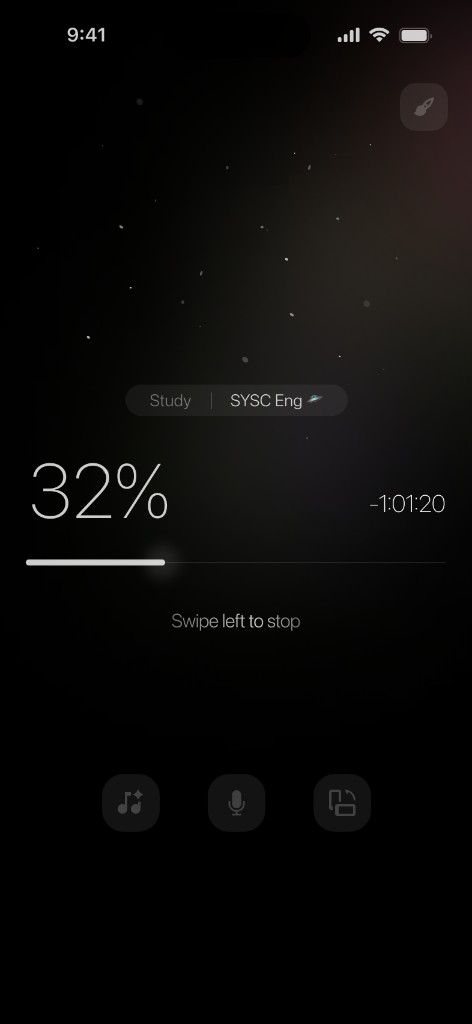
We removed countdowns and numeric indicators, replacing them with ambient, non-evaluative signals.
Result: attention stays on the task, not the clock.
State – support immersion without evaluation
Sessions do not define progress; in focus, the system supports immersion without evaluation.

Return – enable re-entry without penalty
Focus is continuous, not session-based. Sessions do not define progress. Users can enter and exit without penalty.
Result: reduced all-or-nothing behavior.
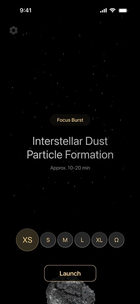
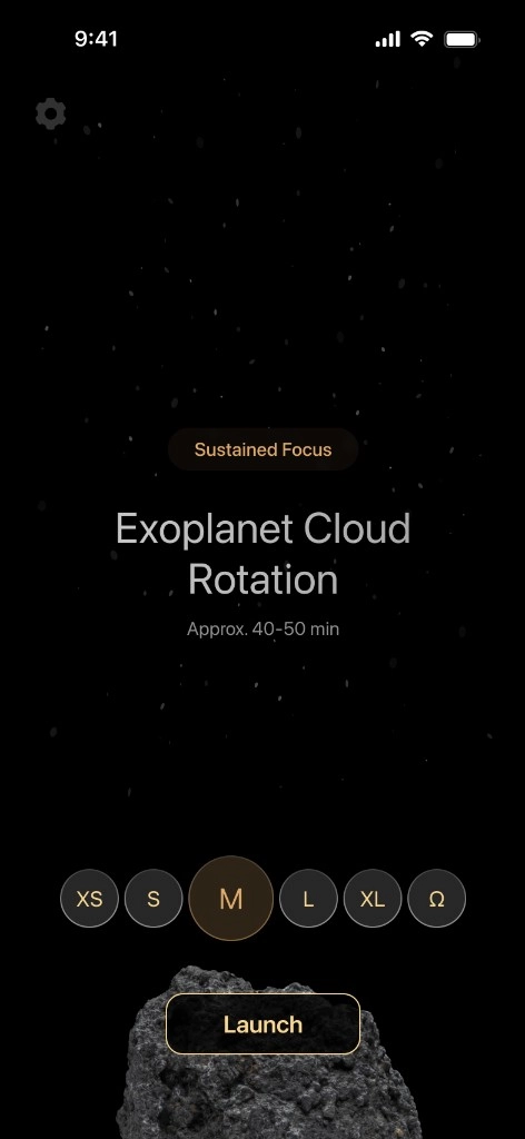
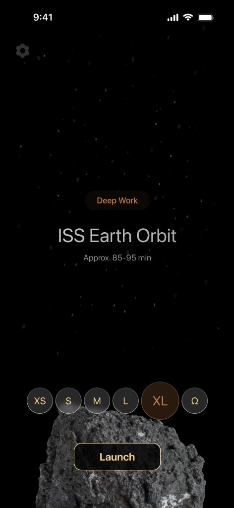
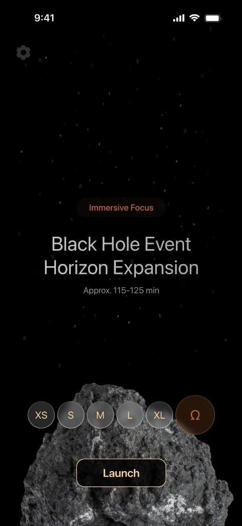
Size as rhythm, not a minute readout
Sessions use XS through Ω to match natural focus cycles; help sheets explain the philosophy without turning the app into a dashboard.
Design decisions
-
Experiential time over measurement
Most tools make time explicit, which invites self-monitoring and shifts attention from the task to performance. We removed countdowns and numeric indicators, replacing them with ambient, non-evaluative signals.
Result: attention stays on the task, not the clock.
-
Focus is continuous, not session-based
Sessions do not define progress. Users can enter and exit without penalty.
Result: reduced all-or-nothing behavior.
-
Minimal interface as boundary
The interface was constrained to reduce decision-making, removing secondary actions and configuration.
Result: faster entry and lower cognitive load.
-
Sustainability over optimization
We avoided features that inflate engagement artificially and focused on repeatability instead of intensity.
Result: more consistent long-term usage.
Minimal interface as boundary
The interface was constrained to reduce decision-making, removing secondary actions and configuration.
Result: faster entry and lower cognitive load.
Tradeoffs
Designing against urgency meant rejecting familiar patterns.
- No visible progress → less perceived productivity
- No streaks → weaker habit reinforcement
- Less data → harder to quantify success
This reduced competitiveness within the category, but enabled a more sustainable experience.
Impact
Polaris shifted user behavior in measurable ways:
- Lower resistance to starting sessions
- Increased return after interruption
- Reduced failure framing in user language
- More consistent engagement independent of session length
These shifts were reflected in both behavioral patterns and qualitative feedback. Engagement moved from performance-driven to repeatable.
Key insight
What a system measures becomes how users evaluate themselves. Removing measurement changed the experience of focus itself.
Reflection
Urgency is often treated as neutral, but in practice it is a behavioral constraint.
Designing without it required redefining success:
- from intensity → consistency
- from output → continuity
- from control → stability
Polaris explores systems that support attention as a rhythm, not a performance.