WiseCal deep dive
Designing the system behind the scan
WiseCal is a camera-first iOS food journal built around AI analysis. After defining the core product experience, I translated that concept into a launch-ready system across product architecture, competitive research, nutrition methodology, monetization, privacy, entitlement, edge cases, design systems, and implementation.
In this write-up: Competitive analysis · Information architecture · Interaction · Product model · Result architecture · Health-adjacent · Monetization · State design · Implementation · MVP · Launch metrics · Reflection

Competitive analysis and category research
I conducted competitive analysis across established calorie trackers and newer AI food-scanning products, including recent US App Store reviews. I looked for recurring patterns in activation, interaction friction, trust, monetization, and information hierarchy.
I translated recurring themes into product constraints around time to value, subscription timing, information density, and tracking behavior.
Capture speed creates immediate value
People responded positively when photo analysis replaced manual food entry and the path from camera to result felt fast. That reinforced making the camera the primary interaction rather than treating photo scanning as a feature inside a conventional tracker.
Paywalls can interrupt trust before it exists
Negative reviews of AI food-scanning products frequently focused on trials, pricing, refunds, unclear subscription expectations, and being asked to pay before experiencing a useful result. That created a clear product constraint:
-
WiseCal needed to demonstrate scan quality before asking someone to subscribe.
Dashboard-first architecture reinforces tracking behavior
Established nutrition products tend to organize the experience around remaining calories, macro targets, charts, goals, and adherence. I did not want WiseCal’s hierarchy to begin there. The food itself became the primary object.
More nutrition data does not necessarily create more understanding
A scan can generate a large amount of information. The interface needed to decide what deserved immediate attention rather than exposing everything the system knew. This shifted the design problem from:
Original question
How much nutrition information can WiseCal provide?
Problem shift
What does someone actually need to understand right now?
Information architecture: why the camera became home
This was an information architecture and product strategy decision. I considered three directions.
-
Dashboard-first
A dashboard could immediately communicate that WiseCal is a serious nutrition product. It would also reproduce the mental model of traditional calorie trackers. The first interaction would be reviewing data rather than creating it.
-
Journal-first
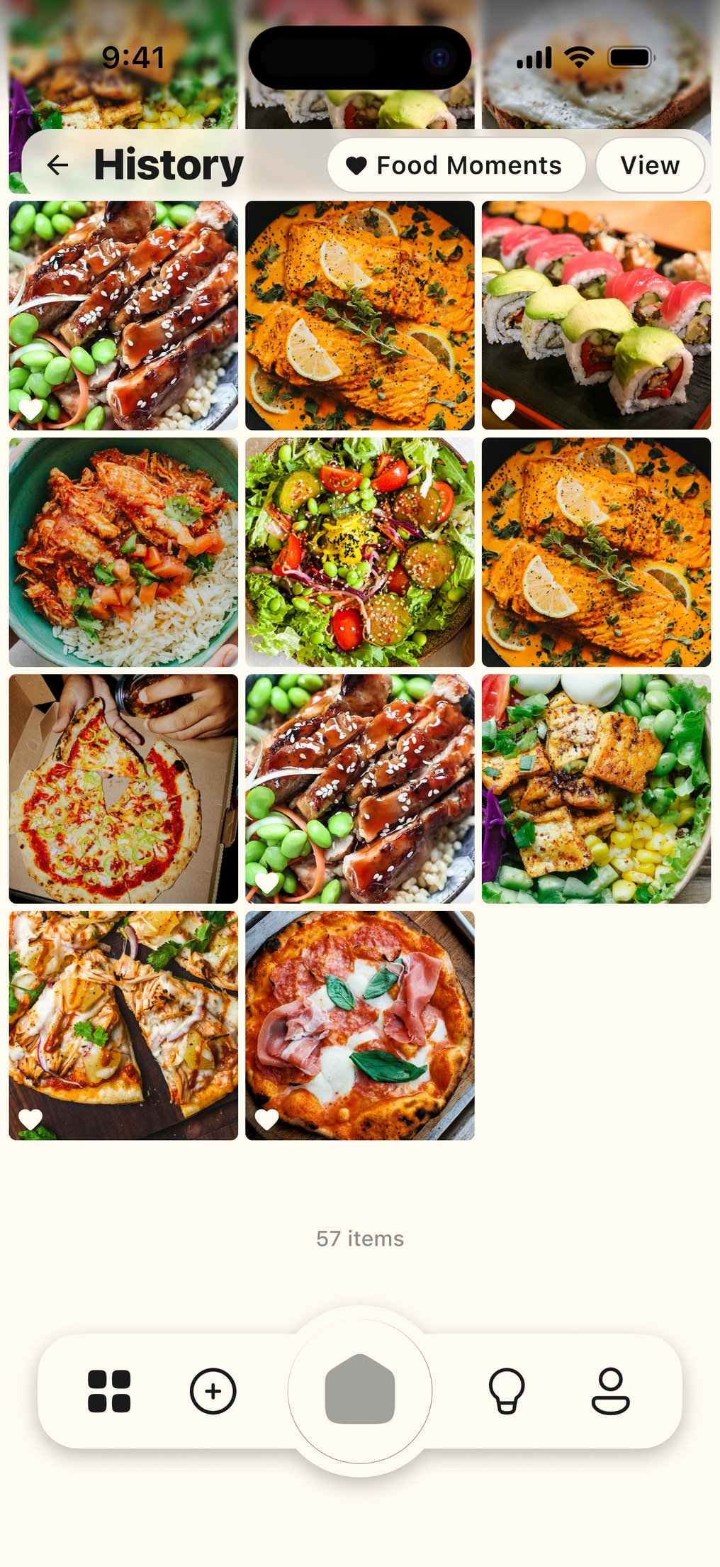
Opening to History would reinforce the idea of WiseCal as a food journal. An empty journal is not useful for a new user, and reaching the product’s main action would still require navigation.
-
Camera-first
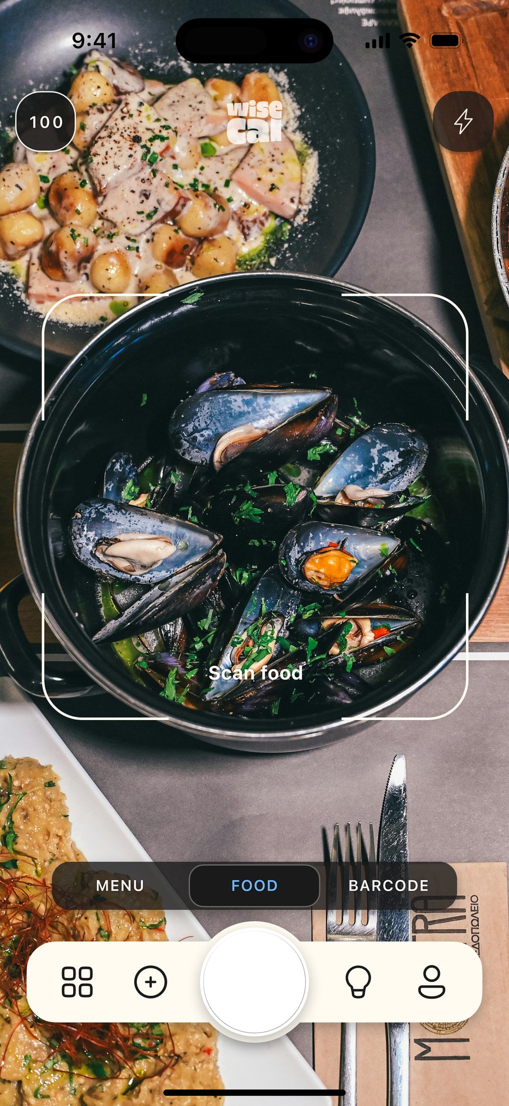
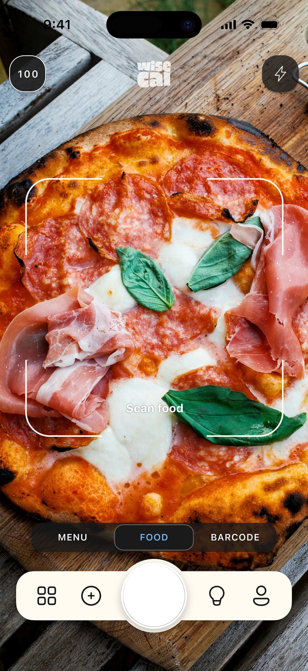
Opening directly to the camera makes the core behavior immediately available. It also turns the value proposition into an interaction: you understand WiseCal by using it.
I chose camera-first because it minimized time to value and made the primary behavior available before the user had created data, configured goals, or learned the navigation. History and Insights remain important, but they are downstream of capture.
Core interaction and state logic
The interaction design is short:
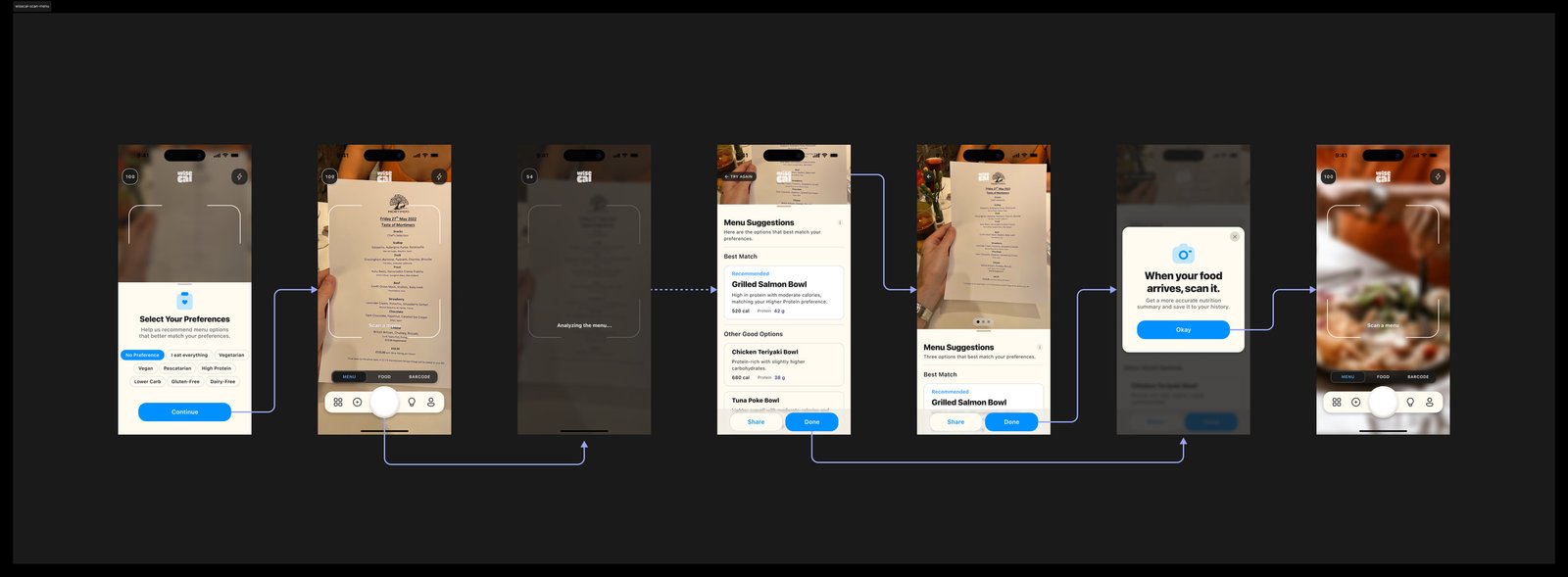
Open → Point → Scan → Understand
I defined the system rules underneath that loop, rather than restating the surface experience:
- no onboarding gate
- no account required before first scan
- no subscription decision before value
- failed analyses do not consume free usage
- Food, Menu, and Products share one capture system
- the full result appears before the next decision
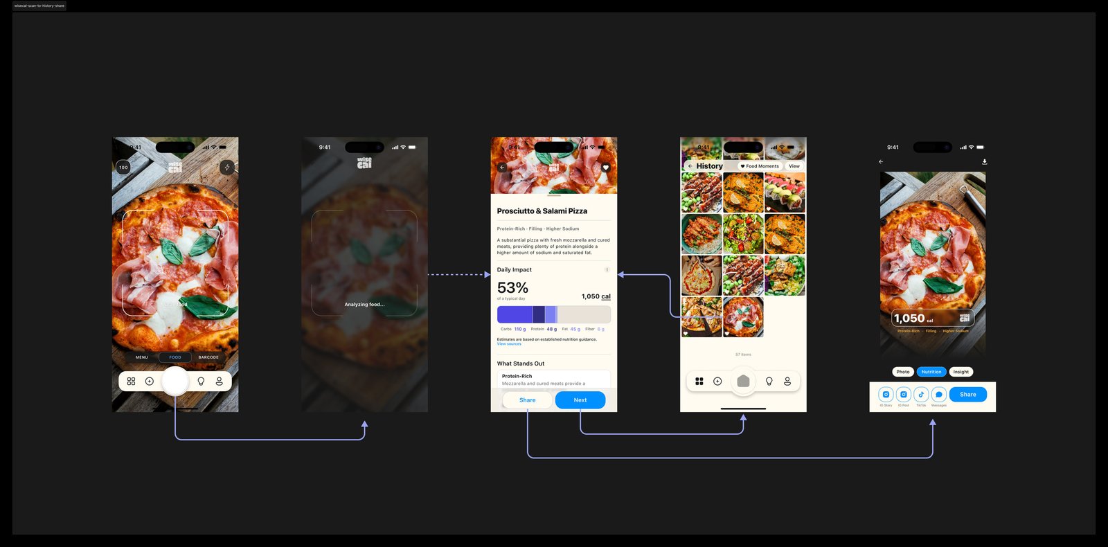
Product model: a scan is an observation
A major product-model decision was separating scanning from consumption. The easiest implementation would have been:
Scan food → add it to today’s intake
I rejected that model. People can scan food for many reasons: deciding what to order, comparing options, scanning another person’s food, checking something they may not eat, testing recognition, or exploring the product.
If every analysis automatically changed daily nutrition data, the system would become less trustworthy. The states remain separate:
Analyze → Understand → Decide whether to consume
This distinction affects History, Insights, daily totals, menu scanning, and error correction. It also makes the underlying model more honest about what the camera actually knows. The camera can observe food. It cannot know whether the user ate it.
I structured the domain around a small set of objects:
-
Scan
contains detected Foods
-
Foods
contribute to Nutrition Signals
-
Signals
accumulate into History
-
History
generates Insights
-
Insights
interpret patterns over time
Result architecture and interaction hierarchy
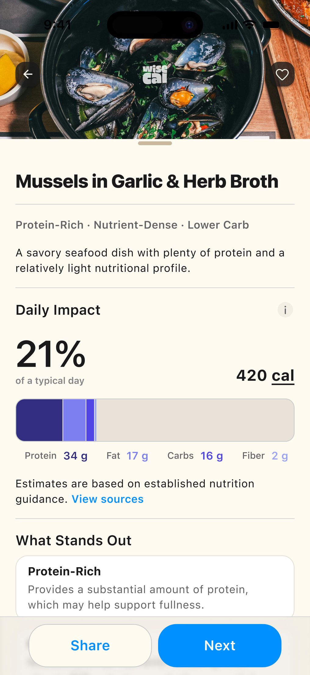
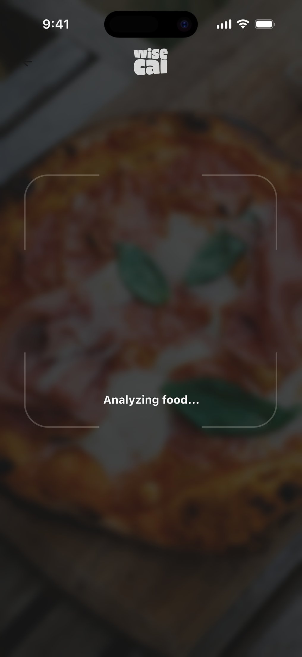
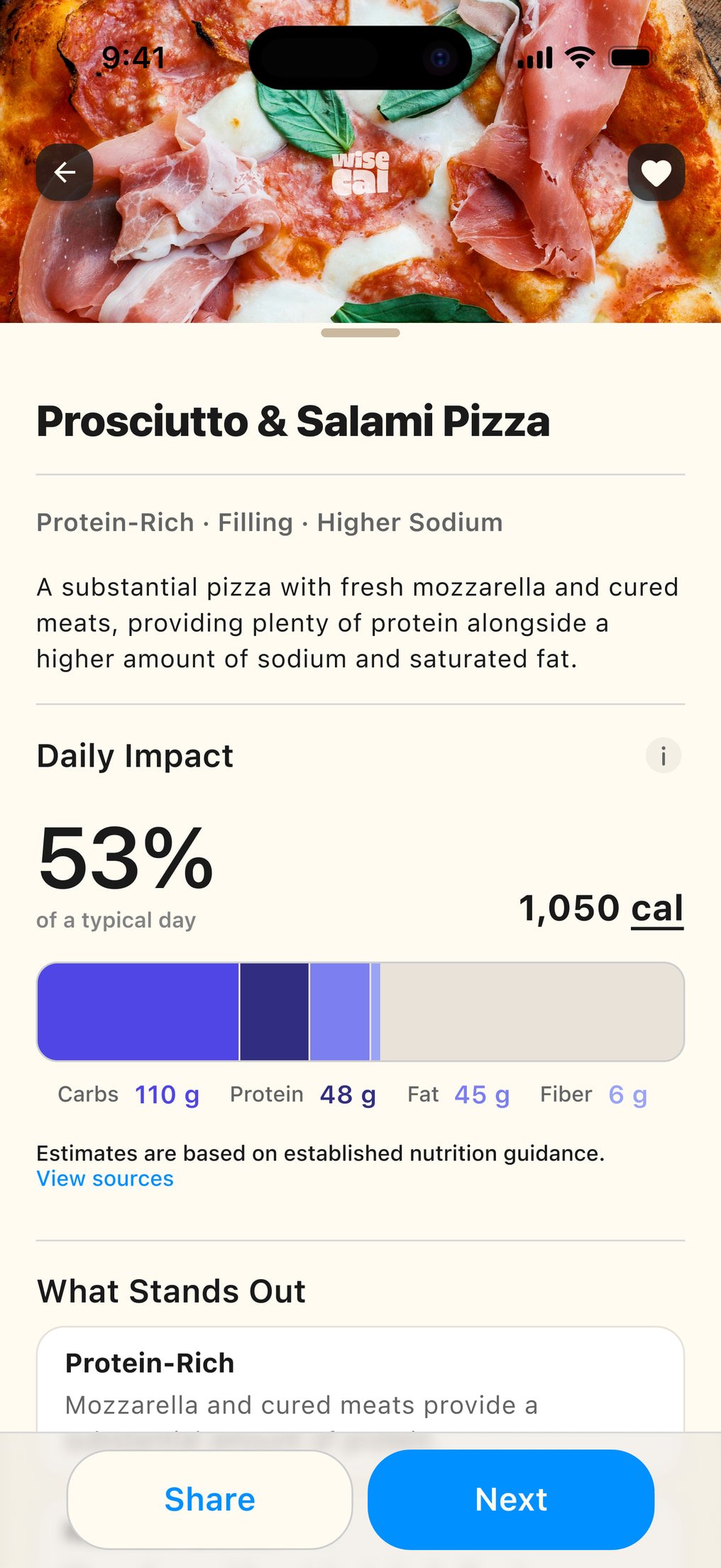
The scan result had to hold three tensions at once: information depth, cognitive load, and speed of comprehension. I organized the result into four layers so the analysis could be useful without becoming a nutrition label at camera speed.
Result layers
-
Layer 1: Identification
Before nutrition information matters, the user needs to know what WiseCal thinks it sees. Food identification sits at the top of the hierarchy. Correction belongs here, because the rest of the analysis depends on that interpretation.
-
Layer 2: Immediate nutrition context
Calories and macros provide a familiar summary. The product can then surface a small number of characteristics that meaningfully stand out rather than reproducing a full nutrition label.
-
Layer 3: Daily context
Where relevant, WiseCal can show how the food relates to the rest of the day. The wording is descriptive rather than disciplinary. The interface is not intended to tell someone whether eating something was good or bad.
-
Layer 4: Action
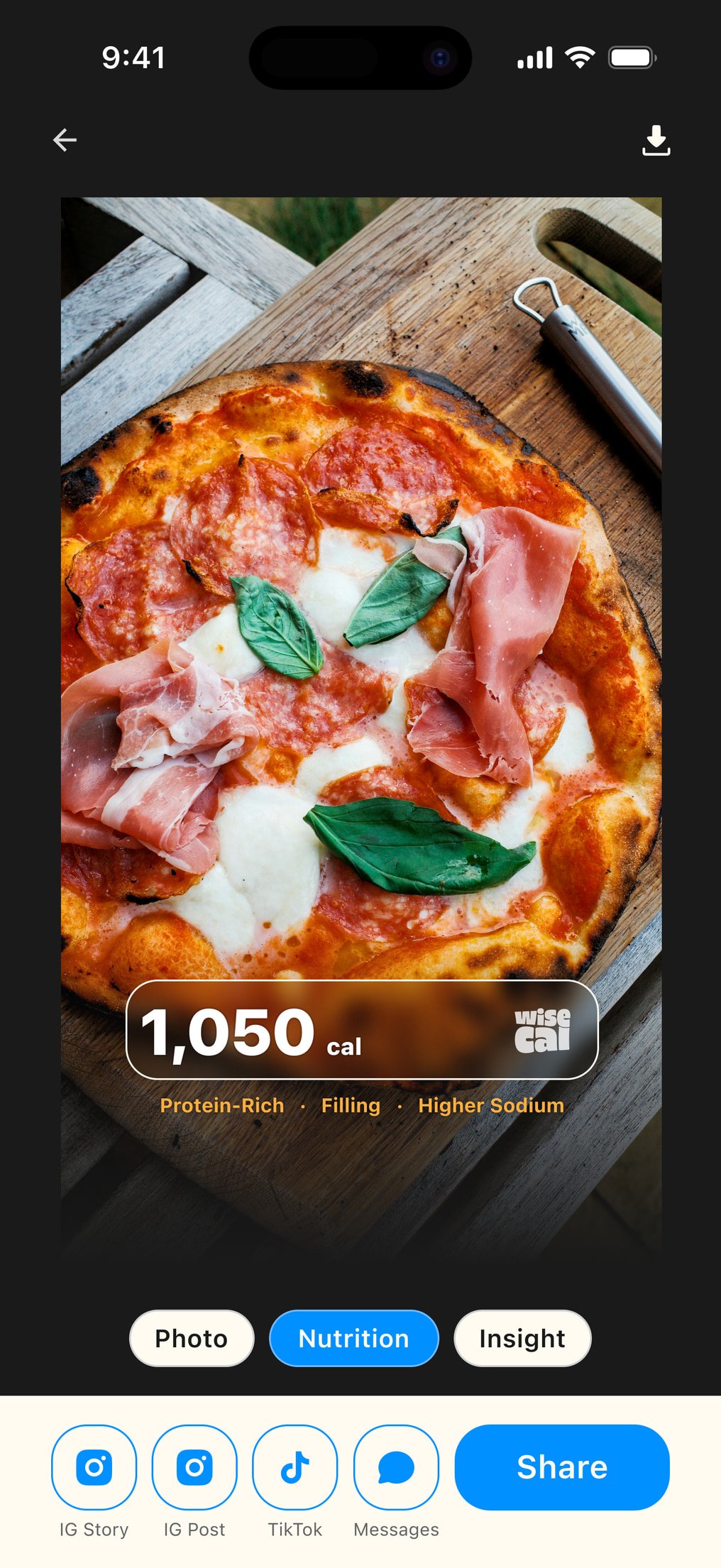
Once the user understands the result, they can add it to their history, correct the analysis, share it, or continue scanning. The same result architecture supports food, menus, products, history, and sharing without creating a new product model for each capture context.
Designing a health-adjacent AI product
WiseCal is not a medical product. Nutrition sits close enough to health that sourcing, accuracy, privacy, and claims required more scrutiny than they would in a general-purpose camera app. App Store review made this concrete. I treated those constraints as product architecture rather than a final compliance pass.
Communicating estimated nutrition data
Nutrition numbers can appear more authoritative than an AI estimate deserves. Calories and macros provide recognizable high-level information. I present them as estimates when they come from camera analysis, not as laboratory measurements. Users can hide calorie values without losing the journal. A polished result should make information easier to understand without making the underlying system appear more certain than it is.
Guidance, limits, and personalization
Daily context can include broader nutritional patterns rather than focusing only on calorie balance. Values such as sodium, added sugar, saturated fat, and fiber need to distinguish guidance, limits, and personalized targets. The interface should not make every value look like the same type of recommendation.
Some recommendations become more meaningful with information about the user. I did not make a completed profile a prerequisite. The core experience works with useful defaults first. Personalization is introduced only when it materially changes the result, so data collection stays proportional to product value.
Designing for awareness instead of adherence
The language system matters as much as the numbers. Many food trackers frame the day around compliance: calories left, over target, goal missed, remaining allowance. I designed for context without judgment.
Remaining today instead of Calories left. Food instead of forcing every entry into breakfast, lunch, or dinner. Optional calorie visibility rather than making calories the mandatory center of the experience.
Methodology and traceability
Nutrition guidance could not simply appear authoritative because the interface looked confident. For daily guidance such as fiber, sodium, added sugar, saturated fat, food groups, calories, and protein, I mapped values back to established public guidance and made the methodology accessible from the product. The goal was not to attach a citation to every screen. It was to make the basis for a recommendation inspectable.
Privacy as product architecture
Privacy requirements affected more than policy text. They influenced:
- when an account is required
- what can exist before authentication
- what third-party services receive
- how deletion is surfaced
- how user controls are organized
- what information is necessary for personalization
Authentication and persistence
Account creation creates another tension. Asking for an account too early adds friction before the product has demonstrated value. Never asking for one makes persistence across devices harder. I therefore separated early product use from long-term identity.
The first scan does not require account creation. Authentication becomes meaningful when the user wants persistent history, account recovery, or continuity beyond the initial experience. The principle is similar to monetization:
-
Ask for commitment after the product has created a reason for it.
Monetization strategy and product economics
Every successful AI analysis creates inference cost. Unlimited free usage is unsustainable. Charging before demonstrating scan quality damages trust. Elapsed time is a poor measure of product experience. Successful outcomes therefore became the free-usage unit.
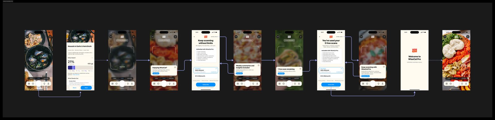
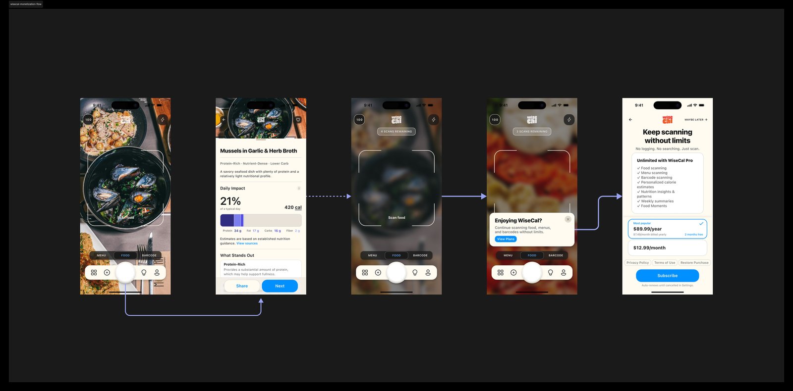
I considered a conventional timed trial. I rejected it because someone could start a seven-day trial, use WiseCal once, forget about it, and still reach a billing decision without understanding whether the product is useful. Instead, WiseCal gives every new user five successful scans. The five scans are a product demonstration rather than an ongoing free tier.
Designing the five-scan demo
-
1
Open
The camera appears immediately. There is no pricing screen before the first interaction. The user does not need an account to discover whether scanning is useful.
-
2
Complete scan one
The first successful result appears in full. Nothing covers the payoff. Only after the result does WiseCal introduce the remaining scan count.
-
3
Scans two to four
The user continues receiving complete analyses. Subscription awareness gradually becomes more visible. Any call to view plans remains optional. The result itself is never replaced by a paywall.
-
4
Complete scan five
The fifth successful result still appears in full. Only after the user has received the complete result does WiseCal present the subscription screen. The paywall can be dismissed.
-
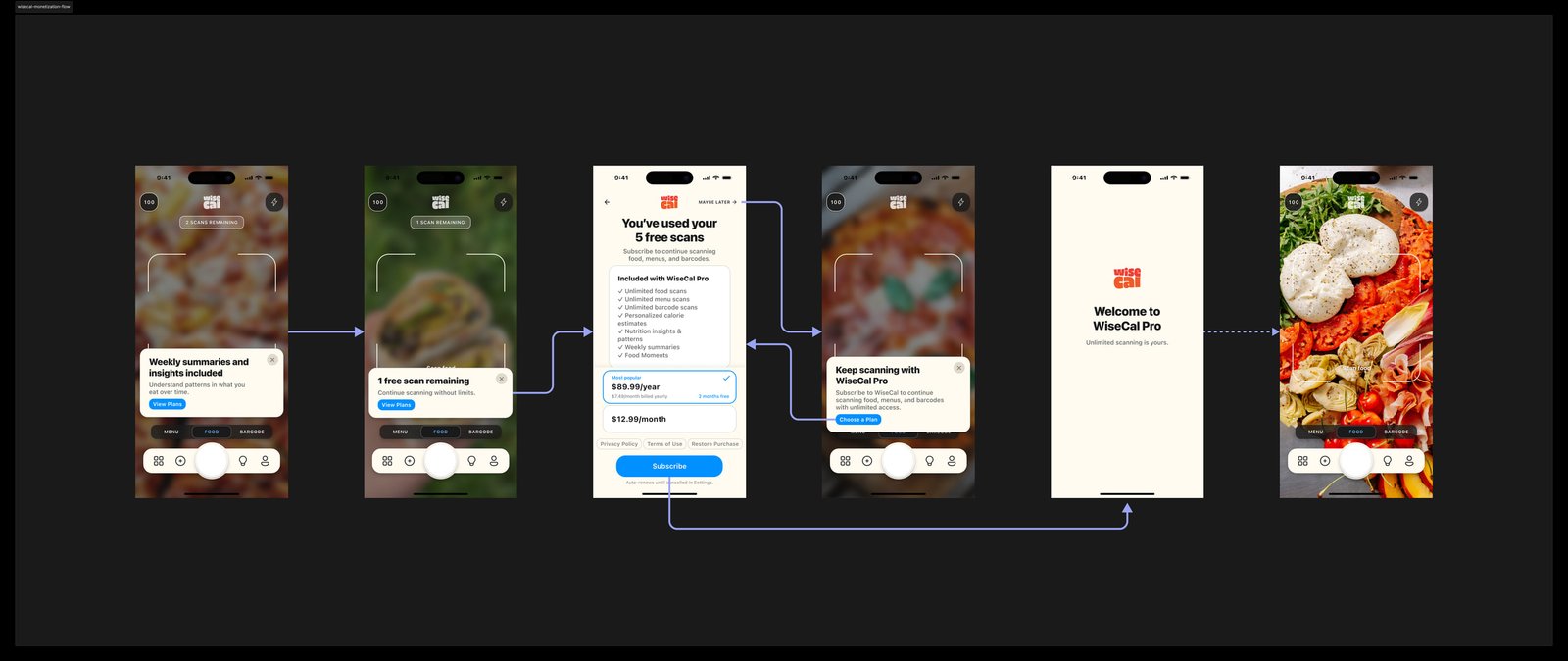
5
Gate new creation
Once the five successful scans have been used, starting another scan requires WiseCal Pro. The camera and other creation actions can lead back to Plans. Existing History remains readable. The scan counter disappears because the demonstration is complete.
Successful outcomes as the unit of value
The free unit is a successful result, not an attempt. I framed this as a trust model, a value-accounting rule, and a business rule. If WiseCal cannot confidently produce a usable analysis, that attempt does not consume one of the five free scans. Users should not lose free value because the product failed to produce a usable analysis.
Entitlement strategy: gate creation, not ownership
The next entitlement question was what should happen after the demonstration ends. The simplest monetization model would lock the entire product. I chose not to.
Subscription controls whether WiseCal can generate new analysis. It does not control whether someone can read information they already created. After the demonstration:
- new food scans require Pro
- new menu analysis requires Pro
- new product analysis requires Pro
- existing History remains readable
- previously generated information remains accessible
- the paywall remains dismissible
This keeps entitlement aligned with recurring cost.
New inference costs money. Reading an existing journal does not.
It also establishes a clearer boundary around ownership. The journal does not become inaccessible because the user decides not to subscribe.
The hard-paywall tradeoff
A hard lock would offer
Stronger immediate conversion pressure and a simpler entitlement model.
The cost would be
More coercive product behavior and weaker access to previously created user value.
I accepted potential subscription leakage to preserve a clearer relationship between payment, recurring AI cost, and ownership of previously created information.
State design and edge cases
The core loop is intentionally simple. The implementation is not. Several states needed explicit behavior.
-
Failed analysis
A failed scan does not consume free usage. The user can immediately retry.
-
Low-confidence analysis
The interface needs to distinguish between a confident identification and an estimate that requires correction.
-
No internet
Because analysis depends on remote inference, connectivity failure needs a clear recovery path rather than appearing as a recognition error.
-
Hidden calories
Hiding calorie values should change the presentation without breaking the rest of the nutrition hierarchy.
-
Subscription restoration
Existing subscribers need a reliable path to restore access without creating a second account or purchasing again.
-
Paywall dismissal
Dismissal does not create a dead end. The user can continue reading existing History and later return to Plans when they choose.
-
Geographic product availability
Product scanning is limited geographically in v1 rather than pretending coverage is universal.
Polished happy paths are insufficient without explicit state behavior. Defining these states kept the primary flow connected to how the product actually behaves.
Design systems, specifications, and AI-assisted implementation
WiseCal was developed through an AI-assisted engineering workflow. That changed what counted as a finished design. A polished Figma screen was not enough. The implementation system needed explicit answers for:
- component states
- empty states
- loading states
- entitlement
- naming
- persistence
- errors
- subscription state
- geography
- content rules
- account state
- personalization
- edge cases
I moved through a workflow closer to:
Research → Product intent → Figma → Behavioral specifications → Cursor → Implementation → Git
Figma remained important, but it was no longer the only source of product truth. Visual design defined the system people see. Written specifications carried the behavioral product truth: decisions that could not be inferred reliably from a screen alone. Git preserved those decisions in implementation.
Design systems as a semantic layer
AI-assisted implementation makes naming and semantics executable instructions rather than internal design organization. A vague component name creates ambiguity. An inconsistent token creates ambiguity. Two visually similar states with different meanings need to be distinguishable in language, not only pixels. I treated the design system as a shared semantic layer between product thinking, Figma, specifications, and code. The question changed from:
Can another designer understand this system?
Can another designer, engineer, or AI agent infer the same product rule from it?
That requires a different level of precision.



MVP scope and launch readiness
I scoped v1 around the minimum complete system required to deliver, retain, and monetize the core scanning experience.
- Camera-first information architecture
- Food scanning
- Menu analysis
- Product capture where supported
- AI analysis
- Result hierarchy
- Correction states
- Explicit consumption
- Visual History
- Nutrition Insights
- Account and persistence logic
- Calorie visibility preferences
- Privacy controls
- Five-scan demonstration
- Dismissible paywall
- Creation-only entitlement
- Monthly and annual plans
- Subscription restoration
- Design system
- Implementation specifications
The product is still pre-launch. The decisions are implemented. The hypotheses still need market evidence.
Launch metrics and product hypotheses
I defined a launch funnel around activation, repeat behavior, journal formation, demonstration completion, and subscription conversion.
-
Does someone experience enough value from scanning food that they choose to do it again?
The product analytics funnel from first interaction through conversion is: Camera opened → Scan initiated → Successful analysis → Result viewed → Saved or consumed → Second scan → Five-scan completion → Subscription decision
-
Time to first successful scan
How quickly does WiseCal prove its value?
-
First-to-second scan conversion
Does the first result create enough value to produce another voluntary scan?
-
Five-scan completion
Is the demonstration long enough for people to form an opinion?
-
Return to shutter
Does scanning become retained behavior rather than novelty?
-
Journal accumulation
Do users create meaningful history across multiple days?
-
Paywall subscribe versus dismiss
What happens after users have demonstrated repeated intent?
-
Subscription mix
How do monthly and annual plans perform once the product has shown its value?
The interpretation matters as much as the metrics. If users disappear after scan one, the paywall is probably not the primary problem. If users repeatedly scan but do not subscribe, monetization becomes a more plausible constraint. If people subscribe but do not return to the shutter, conversion may be masking a retention problem. Different failures lead to different product hypotheses.
Reflection
WiseCal changed how I think about 0-1 product design. The interface was only one layer of the work. Product architecture, AI behavior, economics, entitlement, privacy, implementation, and measurement all shaped what could appear simple on screen.
A simple interface can sit on top of complicated economics, regulation, inference, state, and trust. The job is not to expose all of that complexity. It is to make sure the simplicity on the surface is supported by coherent decisions underneath.