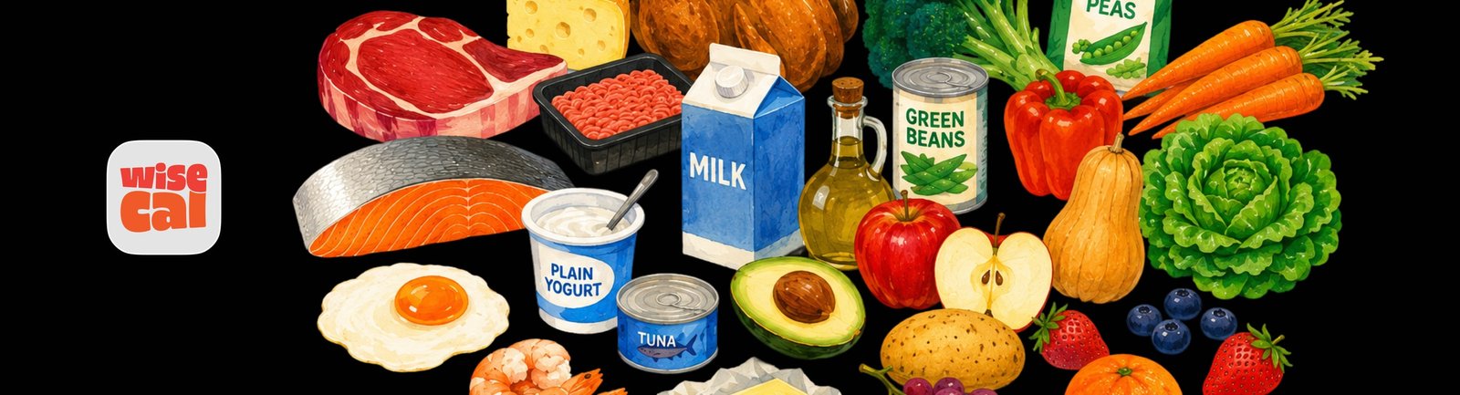
Designing a food journal around the shutter
WiseCal is a camera-first iOS food journal that uses AI to turn a photo into useful nutrition context. I led 0-1 product design end to end, from product strategy and information architecture through interaction design, monetization, design systems, and implementation, taking the product from concept to launch-ready v1.
Problem and product discovery
Traditional food trackers ask people to search databases, select portions, scan barcodes, and maintain a log. I inverted that. I designed WiseCal to start with the camera: interpret the food, give useful context, and let the journal emerge from what people already eat.
I framed the product question as: How little effort should it take to understand and remember what you ate? That had to be answered under real ambiguity. The product still had to be defined.
I ran product discovery through competitive analysis, user interviews, observational research, concept testing, and usability testing. WiseCal is a consumer product in nutrition, next to calorie trackers and newer AI food scanners. The category default is logging. Actual use is restaurants, shared plates, and food people did not cook. I translated that into constraints:
- scanning at a table, not at a desk
- menus as often as plated food
- shared meals where one photo is not one person’s intake
- food that has to be understood before it is eaten
I defined three principles:
-
Capture before configuration
-
Awareness before coaching
-
Demonstrate value before monetizing


Designing the core interaction
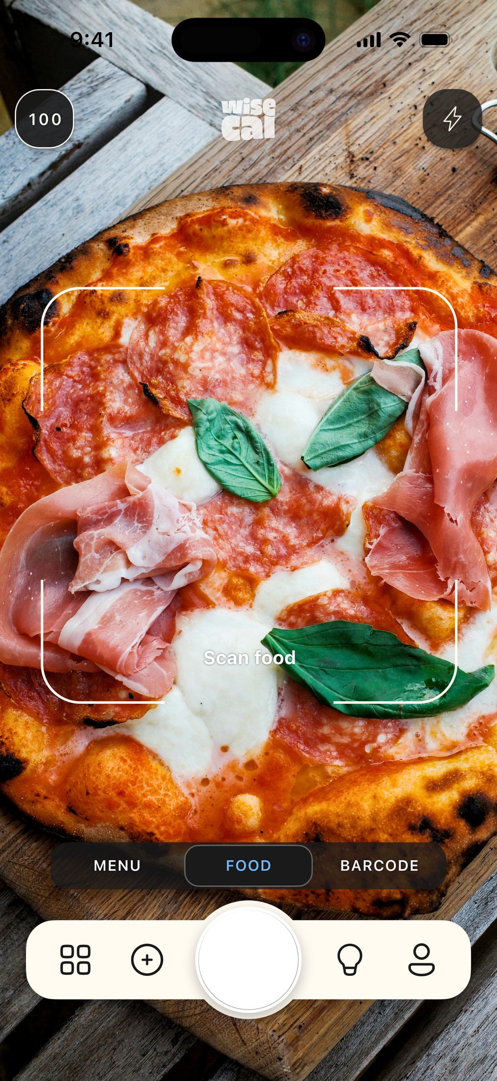
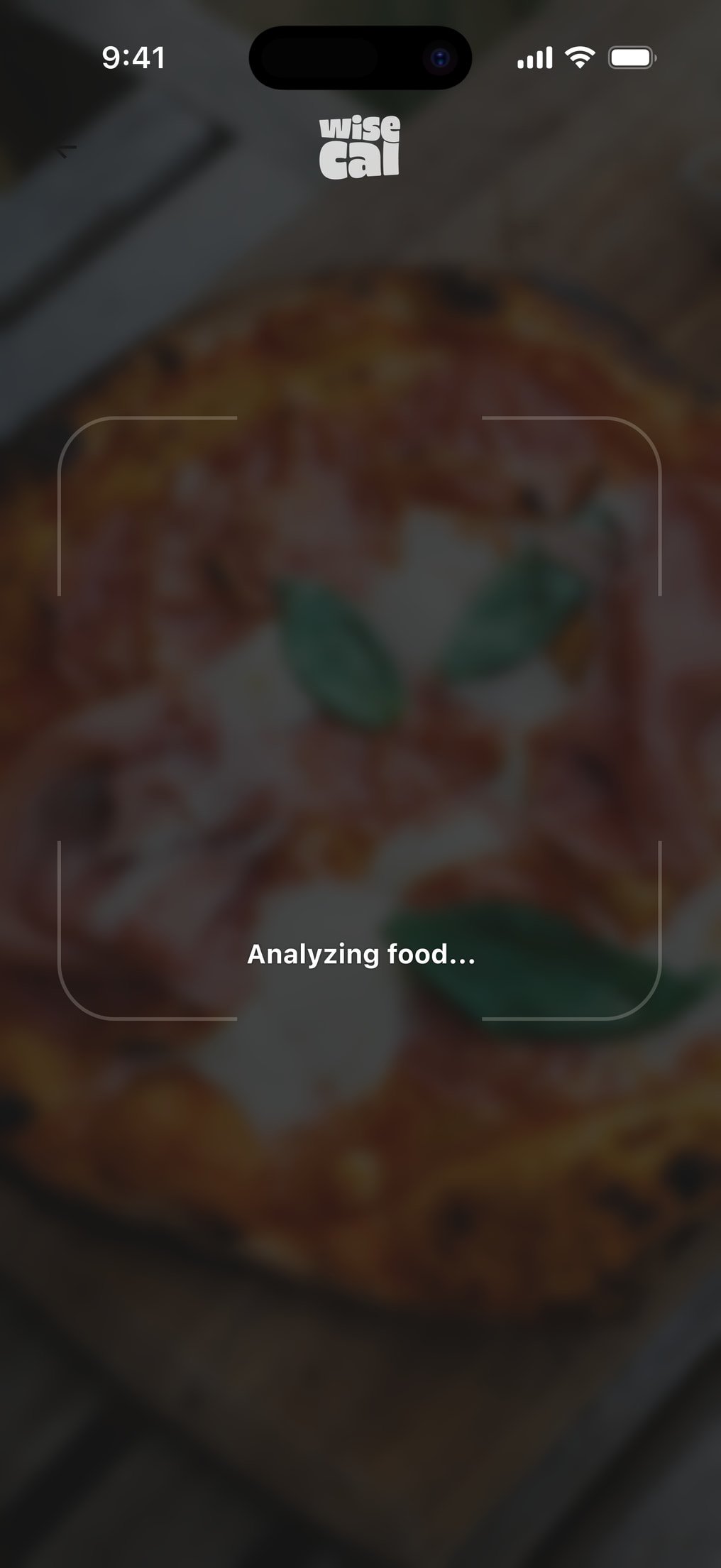
I designed the mobile interaction to be understandable without onboarding:
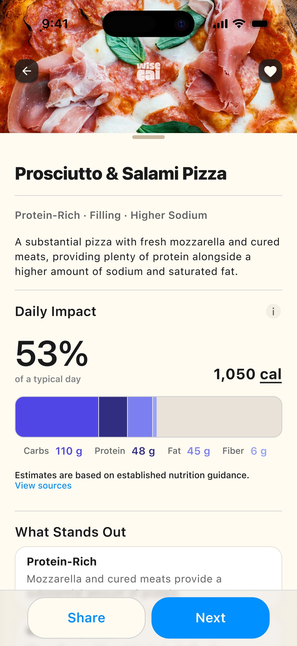
Open → Point → Scan → Understand
The camera is immediately available. I structured Food, Menu, and Products as capture modes in the same system, so the UX stays on the food. Time to value is the first scan.
Product model and information architecture
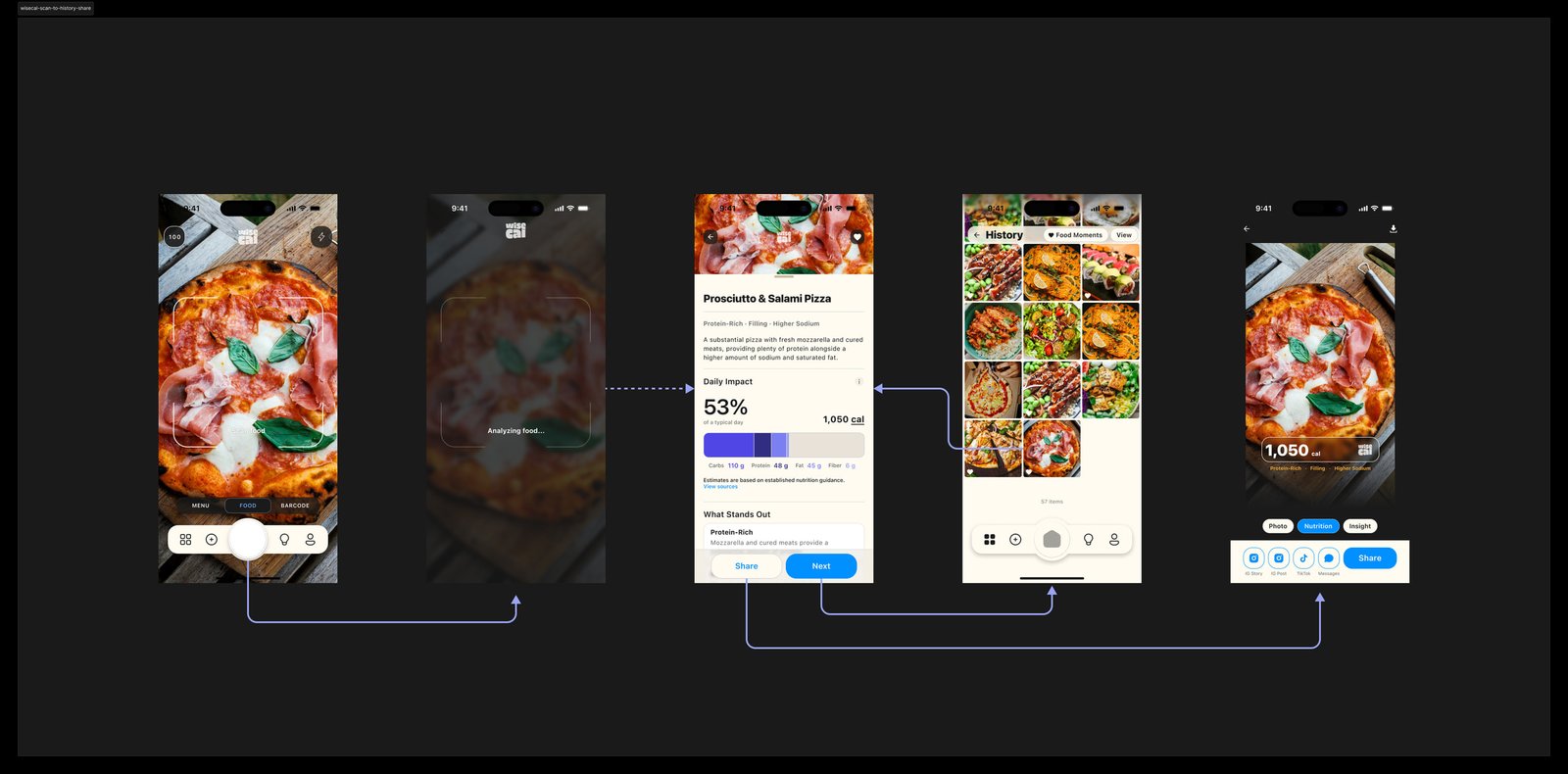
I separated analysis from consumption. Someone can scan food without eating it. A scan creates information. The user decides whether it belongs in their history.
I structured the product around a small set of core objects:
-
Scan
contains detected Foods
-
Foods
contribute to Nutrition Signals
-
Signals
accumulate into History
-
History
generates Insights
-
Preferences
change how recommendations and insights are interpreted
I designed the camera for immediate value and History for continuity. The journal is the byproduct of scanning. I placed Insights downstream. They do not own the first experience.
See food → Scan → Understand → Save → Build history
Key product and monetization decisions
These decisions connect user value, AI inference cost, subscription design, entitlements, and trust.
Camera before dashboard
I made the shutter the center of the information architecture and the default home. A dashboard would have made WiseCal feel like a traditional tracker before anyone experienced what made it different.
Five successful scans instead of a timed trial
Every successful AI analysis carries inference cost. Unlimited free scanning was not a viable business model, and gating the first result would break trust. I chose five successful scans instead of a timed trial. Time is not evidence of experience. Five complete results are. Designing the five-scan demo.
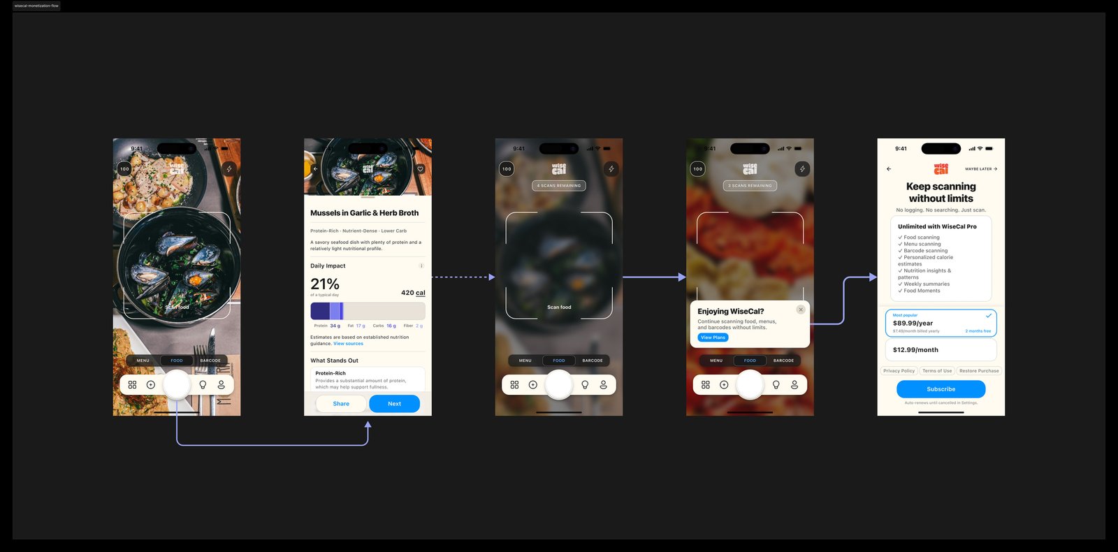
Gate new analysis, not existing history
After the five free scans, I gated new analysis behind WiseCal Pro and left existing History accessible. New inference costs money. Reading an existing journal does not.
Trust, health, and privacy constraints
I organized the scan result around four questions. It has to prove the photo was worth it and stay readable at a glance:
-
What is it?
Confirm identification first. If that’s wrong, everything below it is less useful.
-
What stands out?
I prioritized what’s relevant to understanding the food, not a dense nutrition label.
-
How does it fit into my day?
Daily context, not a score or something to compensate for later.
-
What happens next?
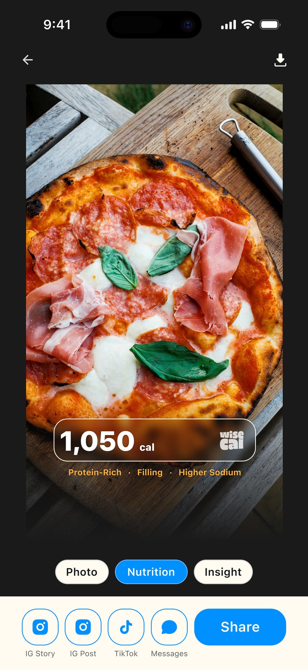
Add, correct, share, or keep scanning. The same result system works across food, menus, history, and sharing.
I designed the language for awareness rather than adherence: Remaining today, not Calories left; food, not enforced meal categories; optional calorie hiding; no profile required first. Nutrition sits close enough to health that I built methodology, privacy, and uncertainty into the architecture. Compliance could not be a final review step. More on health-adjacent constraints.
Design systems and implementation
I worked closely with engineering through an AI-assisted workflow, translating product intent into interface states, interaction rules, entitlement logic, edge cases, content rules, design-system semantics, and implementation specifications. Figma defined the visual system. Written specifications defined behavior. Git was the source of truth.
Naming and semantics stopped being designer hygiene. They became instructions another system had to interpret. See the implementation workflow.
MVP scope and launch readiness
The product is still pre-launch. The decisions are implemented. The hypotheses still need market evidence.
I scoped v1 through prioritization: the minimum system required to ship, retain, and monetize the core scanning experience.
- Camera-first information architecture
- Food scanning
- Menu analysis
- Product capture where supported
- AI analysis
- Result hierarchy
- Correction states
- Explicit consumption
- Visual History
- Nutrition Insights
- Account and persistence logic
- Calorie visibility preferences
- Privacy controls
- Five-scan demonstration
- Dismissible paywall
- Creation-only entitlement
- Monthly and annual plans
- Subscription restoration
- Design system
- Implementation specifications
Launch metrics and success criteria
I defined launch metrics around activation, repeat behavior, demonstration completion, retention, and subscription conversion.
The first question after launch is not simply
How many people subscribe?
It is
Does someone experience enough value from scanning food that they choose to do it again?
-
Time to first successful scan
How quickly does WiseCal prove its basic value?
-
First-to-second scan conversion
Does the first result create enough value for someone to use the camera again?
-
Five-scan completion
Do people naturally reach the end of the demonstration?
-
Return to shutter
Do users come back to scan again without being pushed?
-
Subscription conversion
What happens once someone has experienced five successful results?
These product analytics determine where to look next, and they become the basis for experimentation after launch. If people disappear after scan one, the paywall is not the problem. If they scan repeatedly but do not subscribe after five, pricing and packaging become the constraint.
Reflection
I started with the fastest path from camera to understanding. The work required systems thinking. Architecture, monetization, trust, and health-adjacent constraints cannot be separated.
Where the paywall appears determines what the product treats as valuable. What remains accessible determines who owns what was already created. For products with per-action cost, the job is deciding which actions create new cost, which information already belongs to the user, and how much evidence of quality someone deserves before being asked to pay.